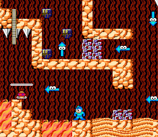
MegaMan_V1
MegaMan
Play Testers: Kenji Vue, Daniel Lee, Weillin Tang, Lenard
What Went Wrong?
After being given the chance to test each other's initial version of our map, I received valuable feedback on what was lacking. The consensus was that my map required enemies to make it more challenging to navigate, rather than simply serving as a walk-through.
What Went Right?
During the gameplay, I found the map's flow to be excellent and gained fresh insights from the group. One of the feedbacks I received was that the players felt the map was clean and they appreciated having multiple pathways to choose from. The traps that were laid out, for example, the lava, were purposely placed next to the quicksand because of how similar they look in color, to throw the player off, making them think they will be safe. (EXAMPLE BELOW)
Improvements for v2
I am planning to enhance the gameplay experience by introducing enemies and expanding the map size. My goal is to make the game more enjoyable by adding challenges that players have to overcome to reach the finish line. The enemies will provide an additional level of difficulty, while the larger map will increase player engagement.
Was the map beginner-friendly?
The map was suitable for their beginner skill level in Mega Man, allowing them to understand the map's flow and how their decisions impact their progress. I had to think about how players must get comfortable with the game itself, so making the map easing to go through was my idea. Having the players understand and know where to go was crucial for me, so I made the map visible, and what I mean about this, is giving it a clean finish, because sometimes it's colors that throw the player off, and I had to make sure it was easy to see when playing the map.


%20(1).png)

Comments
Post a Comment